Rethink Color!

Paint Color Selection
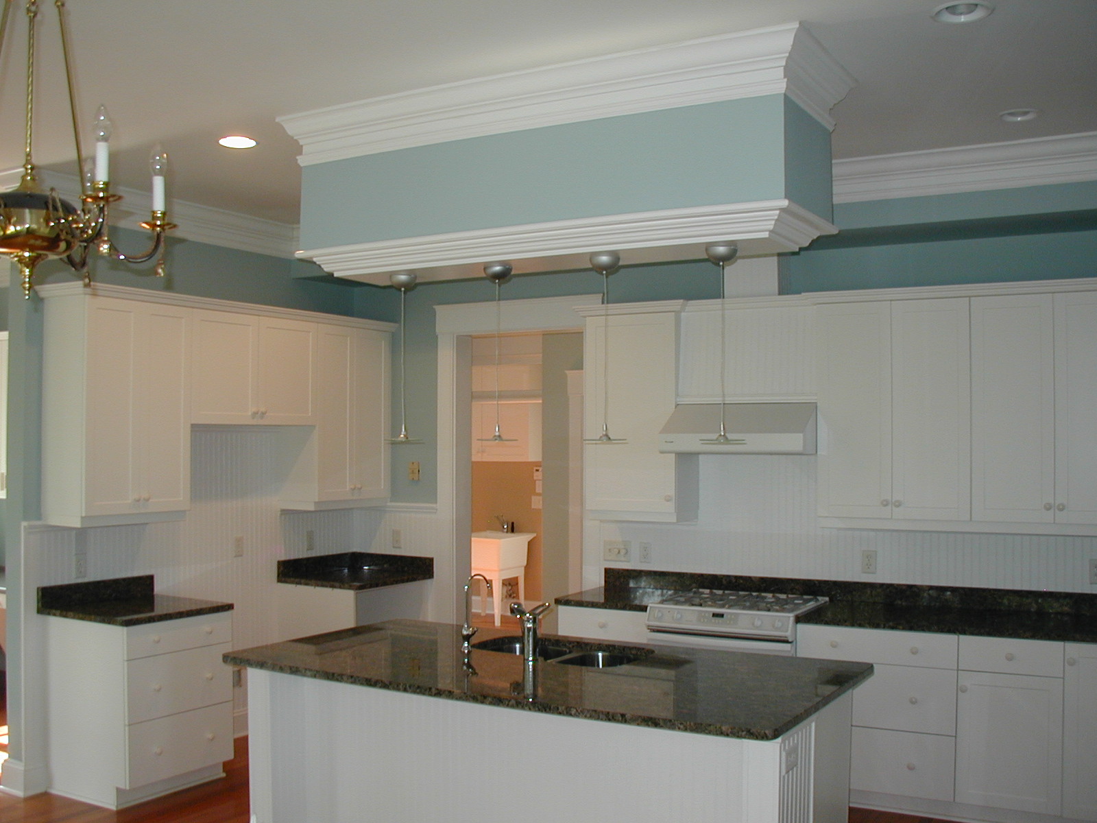
Everyone knows that changing your home’s interior paint colors is the easiest and most cost-effective way to update and upgrade. Over the last few years, neutral choices have become the trend. Muted shades of earth tones such as grays, beiges, and creams, along with calm blues and soft greens are very popular in southeastern N.C. homes. However, after a few years of living with a neutral color scheme, some homeowners may be ready for a little more….well, color!

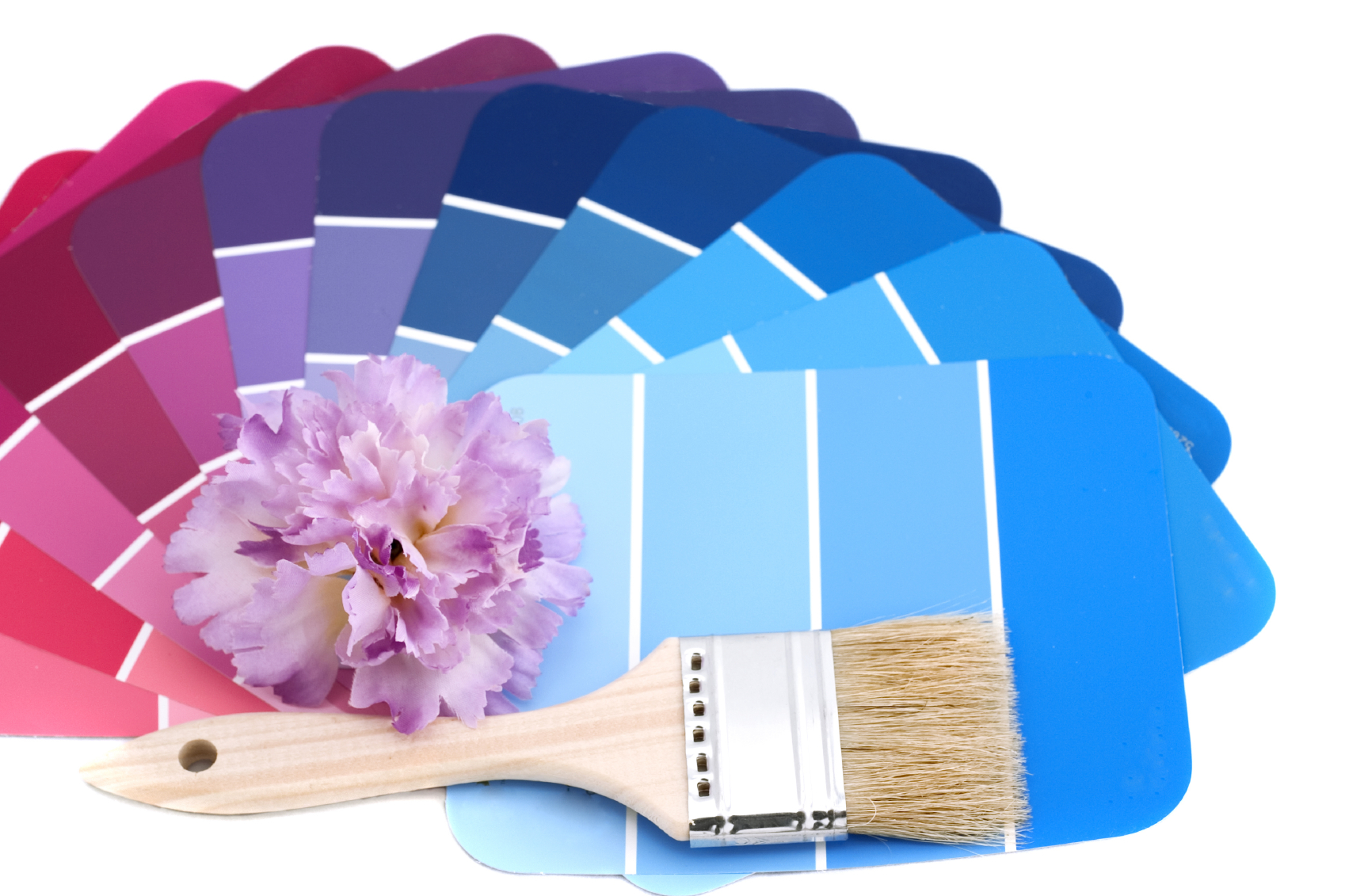
Interestingly enough this year’s “Color of the Year” chosen by the Pantone Corporation is Radiant Orchid. If you’ve ever stopped to think where paint color choices originate, the Pantone Corporation gets the credit for its matching system. It was developed by a chemist, Lawrence Herbert, in the 1960’s. For over 40 years, the Pantone Color Matching System has been used in the creation of fabrics, paints, and plastics. Knowing that, it is no surprise that the color analysts at Pantone are highly regarded for their trend setting predictions.

Radiant Orchid-2014’s Color of the Year, is described as, “An enchanting harmony of fuchsia, purple and pink undertones, Radiant Orchid inspires confidence and emanates great joy, love and health. It is a captivating purple, one that draws you in with its beguiling charm.”

See it here.

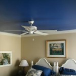
Now if this choice sounds a bit extreme for your walls, remember that painting doors, window frames, trim, ceilings, bookshelf walls, mantles, stairways and banisters, are several excellent ways to introduce some fresh color into your home.

Although painting is an easy and economical choice, the tough part is choosing colors we can live with. If you are hesitant to make a decision and worried that your paint choice will lack staying power, please schedule an appointment with one of our paint experts. Just call 910-686-3067 to choose a time that works best for you!

Related Posts:

Beach House Paint Colors
Classic Paint Colors Ideal for Wilmington NC
Color Therapy

Home Paint Color Trends for 2015


Kitchen & Cabinet PaintingA fresh coat of paint does wonders for a home. Fresh paint covers imperfections, adds a personal touch and can dramatically change the entire look of a room. If you’re considering some new, fresh paint colors for your home, here’s a look at some of the most popular color choices for 2015, according to the home style experts at HouseBeautiful. [Read more…]

Classic Paint Colors Ideal for Wilmington NC

Historic Wilmington NC HomeOne of the greatest things about Wilmington is its colorful landscape – from the sandy browns and cool blues of the beach to the soft pinks and lush greens of downtown’s historic homes, Wilmington is a vibrant place with a great mix of color. If you’re thinking about giving your own home a classic Wilmington-inspired look, here are a few color ideas to consider:

Historic Colors
Some ideas: Confederate Grey, Honeysuckle Yellow, Soft Sky Blue, Candlewick Beige, Soft Rose

Locals and visitors alike are drawn to the beauty and charm of the Wilmington Historic District. The century-old buildings and old-fashioned homes make you feel like you’ve stepped back in time, to the antebellum days of horse-drawn carriages and brick-paved streets. One of the coolest things about historic downtown is the abundance of beautifully restored homes. These homes are perfect examples of historic color. A quick stroll down any of the streets in the historic district, and you’ll see a variety of traditionally historic colors. From soft yellows to cool blues to hazy greys, Historic Wilmington’s color palette evokes the ambiance of the Old South while preserving the look of today.

Coastal Colors
Some ideas: Sea Foam Green, Sand Castle Beige, Driftwood Brown, Sea Glass Green

Coastal colors are typically soft, muted shades of green, blue and brown, but fortunately, you don’t have to be restricted too much when it comes to choosing a color that’s reminiscent of Coastal North Carolina. When you think about the colors of Wrightsville Beach, for example, you might also think about the brightly colored kayaks you’ve seen going through the channel or the bright blue roof of Bluewater Grill. You could even have the best of both worlds by choosing a lighter, more neutral color for your home’s exterior and complement it with some bolder, brighter color for the doors and shutters. Maybe a sandy beige exterior with turquoise shutters would help your coastal home “fit in.”

Bold Colors
Some ideas: Azalea Pink, Tomato Red, Wilmington Hammerheads Blue

Want to give your home a Wilmington-inspired color that will really catch people’s eye? Why not go bold? As most of you may know, Azaleas are a common sight here in Wilmington and are sort of a trademark for the area. The bright pink and vibrant purples of these shrubs’ flowers can evoke feelings of cheer, warmth and energy. (Just make sure your home owner’s association will approve such a dramatic color choice!) Likewise, bright reds are becoming a popular choice for homes, particularly for interior rooms and exterior accents like doors and window shutters. Choose a bright, hearty red – one that reminds you of a fresh summer tomato or bell pepper (common sights in many Wilmington residents’ gardens). If pinks and reds aren’t your favorites, why not go for the opposite end of the color wheel and pick out a bright, bold blue. A bright aqua blue would not only be pleasing to the eye, it would be a great nod to the local soccer team, the Wilmington Hammerheads!

Want more ideas for your home’s color makeover? Contact Colour Solutions today for a free consultation and project quote: (910) 686-3067.

Color Therapy

Color Therapy

Color Therapy or Chromotherapy is the use of color to help modify mood and emotions.

Color therapy, also known as chromotherapy, is the practice of using colors from the visible light spectrum to enhance moods, restore emotional balance and combat a variety of psychological problems. Although some critics argue the validity of this practice, others are more inclined to accept its theories.

While using colors to affect your emotions may seem like a silly theory, there may be some truth in this “pseudoscience” after all. For decades, advertising companies and corporate design teams have utilized color to trigger desired behavior in their customers or employees. For instance, the most common color associated with fast food chains is red. McDonald’s, Hardee’s, Chick-Fil-A and Arby’s all use the color red in their logos and packaging. This is most likely due to the theory that red is an attention-grabbing color that is sometimes associated with appetite. (This is also why red is such a popular color choice for home kitchens and dining rooms).

As another example, pink can sometimes be found in prisons, behavioral health centers or other types of places where residents may need to be confined or subdued. “Passive pink,” as it is called, is used as a calming color, though its effectiveness is often criticized by the scientific community.

As for homes, most interior designers will agree that color has a powerful effect on the overall mood and atmosphere of a room, which in turn will affect the mood of anyone who enters it. If you want to create an inviting space for guests to mingle and feel comfortable, a warm orange (think terra cotta, not traffic cone) may work well. If you’re an artist in need of inspiration, try purple – the color often associated with creativity and spirituality.

While most scientists will agree that color can have an effect on a person’s emotional state, most reject the notion that color has any effect on the physical or physiological aspects of health. While we at Colour Solutions consider ourselves experts when it comes to painting, pressure washing or wood staining, we aren’t exactly equipped to help our clients combat physical or emotional illness. If you find yourself experiencing any physical or psychological problems, you should contact your doctor.

Sources:

Color has a powerful effect on behaviopr – NY Times
Color Therapy for Designers Pt 1: The Meaning of Color – Smashing Magazine 

Choosing Paint Colors as Part of a Home Remodel

Home Remodel and Paint Color Choice

Choosing new paint colors is one of the most important aspects of a home remodel.

A fresh coat of paint can do wonders for a room. Whether you’re space is in need of some serious TLC or you just want a quick and easy way to give your room a makeover without breaking the bank, paint can be your secret weapon against interior design disasters. If you’re about to embark on a home remodeling project, be sure to give some thought to your color scheme and then choose your paint accordingly.

From building an addition to knocking down walls to installing new appliances and light fixtures, any home remodeling project can be further enhanced by incorporating a new paint color. When choosing your colors, it’s important to consider the setting. Depending on the room and what it is used for, you may want something bright and invigorating, or you may want something a little more subdued. For instance, lime green or fire engine red may work well for a kitchen or play room, where there is usually a lot of activity and creativity going on, but such a vibrant shade probably won’t work well in a bedroom or study, where things need to be quiet and calm. Something more along the lines of a soft blue or muted violet would be well suited for a serene atmosphere.

When in doubt, you can always stick with the tried and true neutrals – just don’t go stark white or jet black. Grays, tans and off-white colors like cream or eggshell are standards that offer versatility in design and decorating. But if you’re looking for something a little more fun, don’t be afraid to use color!

If you need help deciding on the perfect paint colors for your home remodeling project, we at Colour Solutions are happy to assist you. Just contact us at 910-686-3067 or request a quote online.

In addition to providing residential painting services, Colour Solutions is also proud to offer commercial painting services, pressure washing, light carpentry work and more. And rest assured Colour Solutions will work hard to ensure your project is handled professionally and to your satisfaction. Check out our testimonials page to see what some of our satisfied clients had to say.

Related Posts:

Interior Paint Colors Can Make a Room Seem Larger or Smaller
 Faux Finishes – When and Where to Use Them